Kategorier
Månad: juni 2020
Kategorier
Infografik för EU-upplysningen
Kategorier
Stockholmskällan
Kategorier
Byrålådan – Fastighetsbyrån
As a part of the frontend core team for the RayCare-product I supported the other development teams in the project with the frontend framework, creating generic, reusable and well tested components.
Kategorier
Åhléns Checkout
My first major project at Åhlens was changing payment provider to Adyen and at the same time converting the existing checkout to a whole new experience.
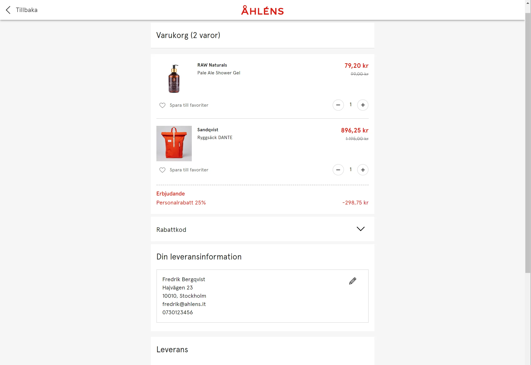
The existing checkout was very cumbersome to use with several steps before even being able to complete a purchase and for every step customers were dropping off.
So much UX and design time was spent streamlining the checkout experience, trying to reduce the number of steps the customer has to complete.
In the end we went from a five-step checkout to, for logged in members, a one- step checkout using the default values.
- Revenue
- 800 m
- Monthly visits
- >3 m
- Mobile devices
- 79%
Tech stack
- TypeScript
- React
- Redux
- Material UI
- Storybook
- Jest
- Lerna
We decided to do a total rebuild, using React and Redux to build a single-page app using only REST APIs so that the checkout can be separated from the back-end in the future.
Lerna was used to split the project into different NPM-packages for reuse on other parts of the website.
All components was developed in a Storybook environment which worked well since the whole checkout is REST-based.
The added bonus with using Storybook is the we automatically get a component library and style guide of the existing components.
Services
- Adyen
- Klarna
- Swish
- Ingrid
- Intershop 7.9
The checkout relies on several external services for payment, tracking and shipping. With Adyen as our payment provider we use widgets for both Klarna and Swish. We also use a widget from Ingrid to handle shipping and where to pick up the package.
Learnings
Use a component library
Using Material UI was a great decision that not only gave us ready to use components, which made building custom components really easy, but it also gave us a base design that we could build on, saving perhaps as much as 25% development time.
Beware bad APIs
Unfortunately the REST API in Intershop 7.9 leaves a lot to be desired, with several calls having to be made for every basket update.
This is said to be better in Intershop 7.10.
Links
When we started using Material UI (version 3) the support for extending the built-in theme was pretty lacking. The theme interface did not handle any additional color settings such as ”success” or ”warn” and trying to extend the theme did not work since parts of interfaces can’t be overwritten.
So instead of extending the theme we used a separate object with corresponding interface to handle the extra colors that we needed. Not ideal but as the colors only were used in a few places we could afford to wait for the support in MUI to get better.
Flash forward a year and the support is here so extend the theme we did!
The documentation tells us to use module augmentation to merge our theme with the built-in theme by creating a index.d.ts file and adding our properties in that.
The official way of doing it
So if I want to extend the typography object to accept a secondaryFontFamily I would have to do something like this:
declare module "@material-ui/core/styles/createTypography" {
  interface TypographyOptions {
    secondaryFontFamily: string;
  }
  interface Typography {
    secondaryFontFamily: string;
  }
}
And then creating a custom theme factory function to create the theme.
import { createMuiTheme} from '@material-ui/core/styles';

export const createMyTheme():CustomTheme => createMuiTheme({
  palette: createPalette({}),
  typography: {
    secondaryFontFamily: "Georgia"
  }
});
This works well but still uses the Theme interface which makes it harder to know what has been extended.
Our project setup
We package our code in different NPM packages and use Lerna to handle the development environment.
That means that the theme is used over several packages and when we implemented the solution above we quickly realized that we had to add the index.d.ts file in every project, making it very cumbersome to add new attributes in the future.
Back to the drawing board.
A different solution
So we need an interface for our customised theme that we can share with our packages.
import React from "react";
export interface CustomTypography extends Typography {
  secondaryFontFamily: string;
}
export interface CustomTheme extends Theme {
  typography: CustomTypography;
}

export const createMyTheme():CustomTheme => createMuiTheme({
  palette: createPalette({}),
  typography: {
    secondaryFontFamily: "Georgia"
  }
});
That will unfortunately result in the following error:
TypeScript does not allow interfaces to be merged and since CustomTheme extends Theme it seemed that we are out of luck.
Then I discovered Omit.
TypeScript Omit to the rescue!
Omit<T,K>is an utility type that constructs a type by picking all properties from T and then removing K.
So by using Omit we can create our own utility type Modify. (Props to Qwerty )
type Modify<T, R> = Omit<T, keyof R> & R;Which will merge two interfaces, removing any members on T that exists in R and then adding R to the resulting type.
So using Modify we can do this instead:
import { Theme } from "@material-ui/core";
import { Typography } from "@material-ui/core/styles/createTypography";

export type CustomTypography = Modify<
  Typography,
  {
    secondaryFontFamily: string;
  }
>;

export type CustomTheme = Modify<
  Theme,
  {
    typography: CustomTypography;
  }
>;


export const createMyTheme():CustomTheme => {
  const baseTheme = createMuiTheme({
    palette: createPalette({})
  });

  return {
    ...baseTheme,
    typography: {
      secondaryFontFamily: "Georgia"
    }
  }
});
And use it in our app like this:
const MyApp = () => {
const myTheme = createMyTheme();
  return (
    <ThemeProvider<CustomTheme> theme={myTheme}>
      <CssBaseline />
        <SomeComponent />
    </ThemeProvider>
  );
};
I hope this can help get someone with the same problem some ideas and if you have solved the problem in another way, please let me know.